Project Duration
April – May 2023
Industry
Food & Beverage
Responsibilities
User Interview, Usability Testing, Data Analysis, Design System, UI Design
Ordering Sushi Should Be Easy, Even for First-Timers

Excuse Me, Is this mine?
This isn't what I expected.
While working as a server at Kibo Sushi, I often saw customers confused or disappointed after receiving their orders. In the restaurant, we could quickly clarify or assist, but I realized that customers ordering from home didn’t have that same support. This led me to explore how the online ordering experience could be improved through a UX/UI case study.
Project Goal
Designed an online ordering app for Kibo Sushi to improve the user experience based on real usability issues. Focus on customers who are unfamiliar with sushi to help them order easily.
Project Scope
Designed a mobile ordering app for Kibo Sushi to help users — especially those new to sushi — browse, customize, and order with confidence.
RESEARCH
Survey Insights
A short survey was conducted with participants who were relatively unfamiliar with sushi.

88% of respondents described the sushi ordering process as very confusing, pointing to a need for clearer, more intuitive menus.

63% said they had received food that wasn’t what they expected, suggesting gaps in how menu items are presented or understood.
User Interviews
To better understand user needs, nine interviews were conducted with participants who had previously ordered from Kibo Sushi. The conversations focused on their experiences with sushi ordering, whether dine-in, pickup, or delivery, and explored common challenges and desired improvements. The goal was to identify key pain points and uncover opportunities to enhance the online ordering experience.
Topics covered in the interviews included:
· Usual process for ordering sushi
· Challenges or frustrations during the ordering experience
· Desired features or functions
· Interest in options like allergy filters or ingredient details
· Reasons for avoiding Kibo Sushi’s online ordering platform
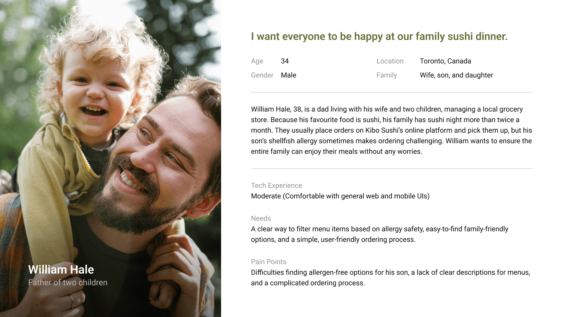
Persona
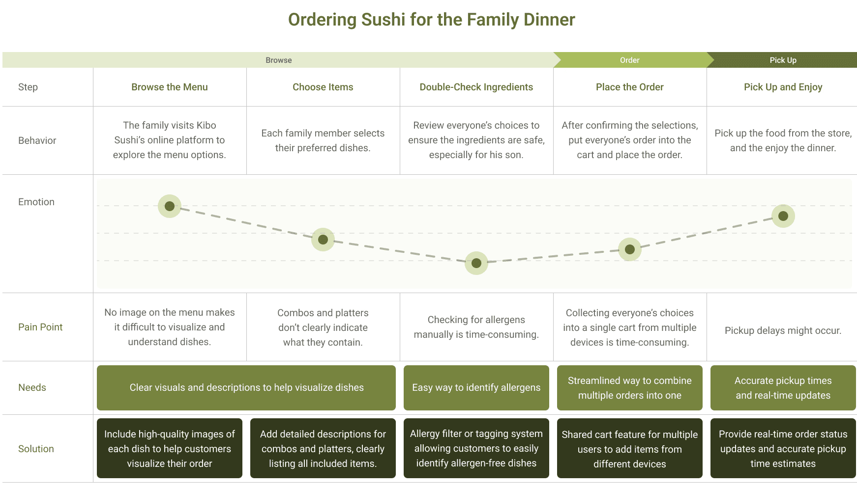
User Journey Map
RESEARCH
An interview was conducted with a manager at Kibo Sushi to understand how their online ordering platform performs from the business side. Although the platform is available to customers, it receives significantly fewer orders compared to third-party apps like Uber Eats and SkipTheDishes.
The manager also shared concerns about the limited chance to promote new deals or updates, making it difficult to drive engagement.
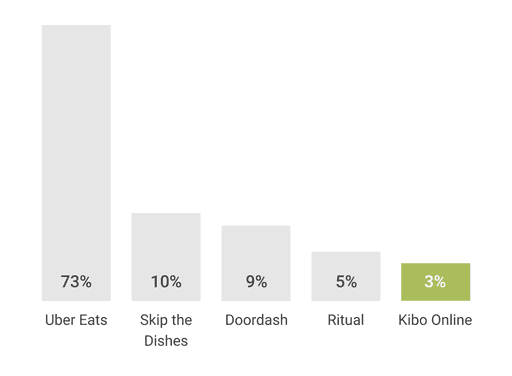
Order Volume by Platform

Fee Comparison by Platform
PAIN POINTS
Lack of Visual Guidance
A lot of menus were lack of photos, so customers unfamiliar with sushi can’t visualize what they’re ordering, leading to hesitation or mistakes.
Unclear Menu Descriptions
Many items use Japanese ingredient names that require external research. Combo and platter options often lack clear breakdowns of what’s included.
No Clear Benefit to Use the Platform
The Kibo Sushi online ordering system offers no distinct benefits compared to third-party apps, making it easy for users to choose alternatives.
PROJECT DIRECTION
Let users filter out ingredients based on allergies.
Add photos to help users understand what they’re ordering.
Show what’s included in set menus at a glance.
Make it easier for groups to order together without sharing one device.
Communicate with Customers
Promote new deals and stay connected with users
Encourage customers to use Kibo's own platform
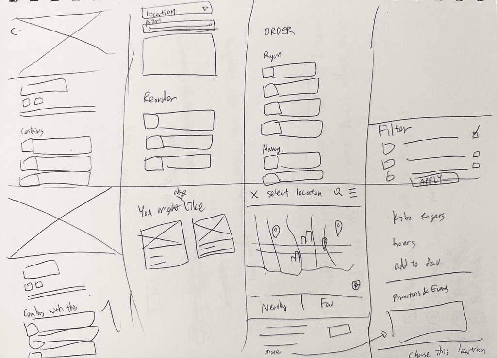
DESIGN PROGRESS


RESULT
The prototype was tested with four users. In the first round, they were asked to add specific items to the cart while considering allergen limits on the original website. In the second round, they added the same number of different items with varying allergen limits. On average, users completed the task over 30% faster.
KEY TAKEAWAYS
As an individual who is familiar with Japanese food and has no allergies, conducting user interviews revealed a lot of unexpected pain points. Before, allergy considerations weren’t integrated into the ordering flow. Users found it time-consuming and frustrating to check allergens for each menu item individually. Another key insight was that adding photos benefited not only those unfamiliar with Japanese cuisine but also improved the experience for all users. This change led to a more than 30% reduction in time spent navigating the menu, as demonstrated by comparing the usability testing results between the original Kibo Online ordering platform and the final design.
However, since users had already viewed the menu on the original website, the second round of testing may have been faster. If I can conduct the testing again, I would conduct the test with half the users starting with the original website and the other half with my design